This is the new and updated version of my article here: LearnPress Lesson Template Changes
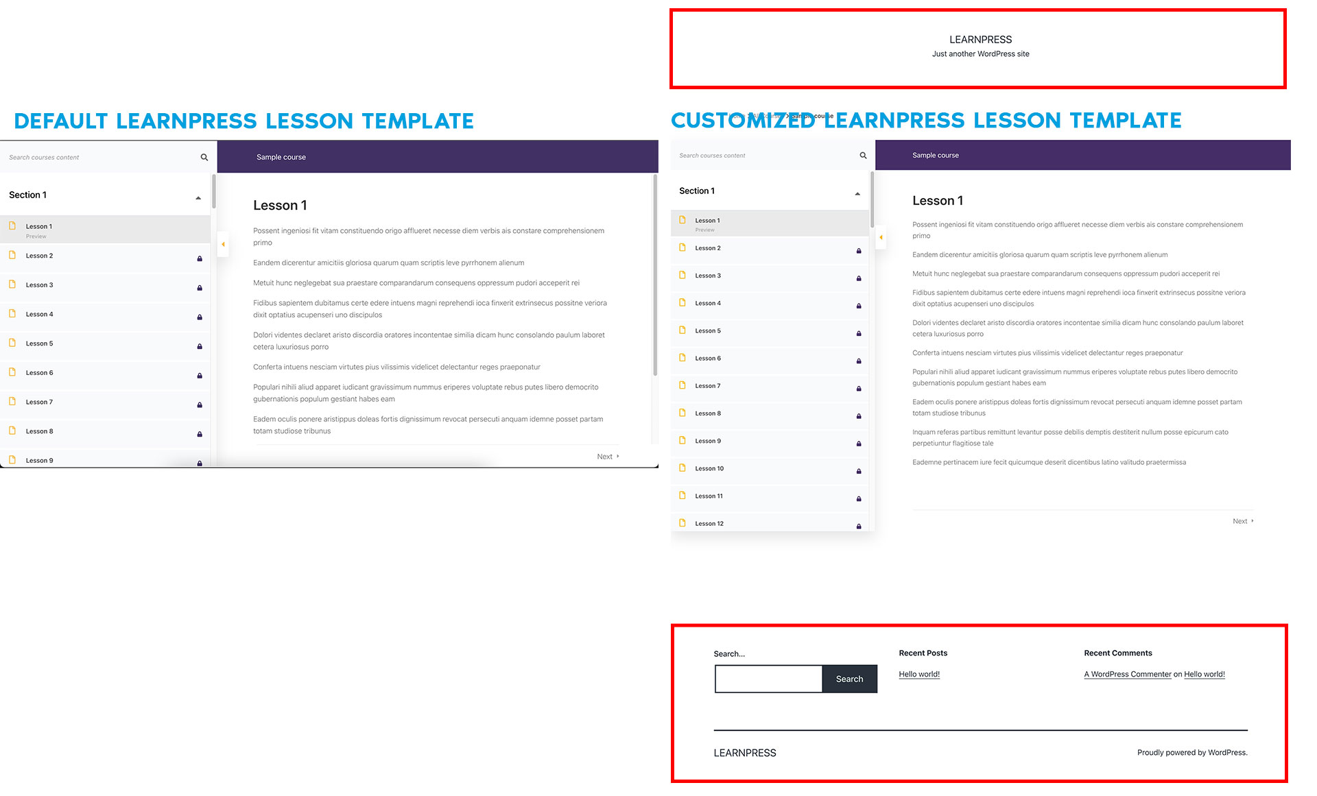
I got to admit, it is quite simpler in terms of files than before.
Turns out it is now possible to edit with only CSS and make our Header and Footer show in current implementation of LearnPress plugin.
WordPress Version : 5.7.2
Theme Twenty Twenty-One : 1.3
LearnPress Version : 4.0.7
Quick Start
Here, is the fast answer you need and keep on moving.
/*Learn Press Lesson Template Design Changes*/
html {
    overflow: visible !important;
}

#popup-course {
    position: relative !important;
    flex-wrap: wrap;
}

#popup-course > div {
    position: relative;
    flex-basis: 100%;
}

#popup-course #popup-header {
    position: absolute !important;
}

#popup-course #popup-content {
    flex-basis: calc(100% - 475px) !important;
}

#popup-course #popup-footer {
    position: absolute !important;
}
Contain the width
Now if the lesson content area is full width, and you want it contained, like the header and footer, we need to do more. Not necessarily important, but could be helpful to someone.
Lets contain the main section
main#main {
    max-width: var(--responsive--alignwide-width); // this is the max-width you want your container to be e.g.1170px
    margin: 0 auto;
    border: 1px solid;
}
Lets make the curriculum sidebar smaller around 300px.
#popup-course #popup-sidebar {
    flex: 0 0 300px !important;
}
#popup-course #popup-sidebar .course-curriculum {
    width: 300px !important;
}
After that compensate the “300px” width to lesson’s header, footer, toggle collapse arrow
#popup-course #popup-header,
#popup-course #popup-footer,
#popup-course #sidebar-toggle {
    left: 300px !important;
}
And finally adjust toggled case
body.lp-sidebar-toggle__close #popup-course #popup-sidebar {
    flex: 0 0 0 !important;
}

body.lp-sidebar-toggle__close #popup-course>#sidebar-toggle,
body.lp-sidebar-toggle__close #popup-course #popup-header,
body.lp-sidebar-toggle__close #popup-course #popup-footer {
    left: 0 !important;
}
P.S. For responsive, you’re on your own. 🙂
Leave a Reply